This work is licensed under a Creative Commons Attribution-ShareAlike 3.0 Unported License. This means that you are able to copy, share and modify the work, as long as the result is distributed under the same license.
Network Visualization and Analysis with Cytoscape: Enrichment Map from GSEA results
By Veronique Voisin
Goal of the exercise:
Create an EnrichmentMap and navigate through the network
During this exercise, you will learn how to create an EnrichmentMap from gene-set enrichment results. The enrichment tool chosen for this exercise is GSEA but an enrichment map can be created from various gene-set tools using the generic format or the more specific g:Profiler or BiNGO interface.
Post analysis (add drug target gene-sets to the network)
As second part of the exercise, you will learn how to expand the network by adding an extra layer of information.
Autoannotate
A last optional exercise guides you toward the creation of automatically generated cluster labels to the network.
Data
The data used in this exercise is gene expression data obtained from high throughput RNA sequencing used in Module2 . They correspond to Ovarian serous cystadenocarcinoma samples. We use precomputed results of the GSEA analysis performed in module 2 to create an Enrichment Map with the aim to transform the tabular format in a network to better visualize the relationships between the significant gene-sets.
GSEA output and EnrichmentMap
The output results of GSEA are 2 tables:
-
One table (pos) contains all pathways with an enrichment score (significant or not) related to enrichment of the mesenchymal category (positive score).
-
One table (neg) contains all pathways with an enrichment score (significant or not) related to enrichment of the immunoreactive category (negative score).
-
These 2 tables are uploaded using the EnrichmentMap App which will create a network of mesenchymal and immunoreactive pathways that have a significant score (FDR <= 0.0001) for clearer visualization of the results.
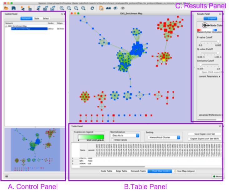
EnrichmentMap
-
A red circle (node) is a pathway specific of the mesenchymal type.
-
A blue circle (node) is a pathway specific of the immunoreactive type.
-
Green edges
represent genes in common between 2 pathways (nodes).
-
A cluster of nodes represent overlapping and related pathways and may represent a common biological process.
- Clicking on a node will display the genes included in each pathway.
Start the exercise
To start the lab practical section, first download the files.
7 Files are needed to create the enrichment map for this exercise (please download these files on your computer):
-
GMT (file containing all pathways and corresponding genes) - Human_GOBP_AllPathways_no_GO_iea_December_24_2015_symbol.gmt
-
Expression (file containing the RNAseq data for all samples and all genes) - MesenchymalvsImmunoreactive_rnaseq_expression.txt
-
Enrichments 1 (GSEA results for the “pos” mesenchymal phenotype) - gsea_report_for_na_pos_1453222854028.xls
-
Enrichments 1 (GSEA results for the “neg” immunoreactive phenotype) - gsea_report_for_na_neg_1453222854028.xls
-
Rank file (file that has been used as input to GSEA) - MesenchymalvsImmunoreactive_edger_ranks.rnk
-
Classes (define which samples are mesenchymal and which samples are immunoreactive) - MesenchymalvsImmunoreactive_rnaseq_classes.cls
-
Drug target database (preselection of 4 drugs and their target genes u sed in the poast -analysis exercise, http://www.drugbank.ca/) - Human_DrugBank_approved_symbol_selected.gmt
Follow the steps described below at your own pace:
Step 1
Launch Cytoscape and open Enrichment Map App
1a. Double click on the Cytoscape icon
1b. Open Enrichment Map App
-
In the top menu bar:
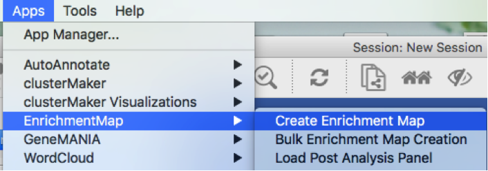
- Click on Apps -> Enrichment Map -> CreateEnrichment Map
Step 2
Create an EnrichmentMap
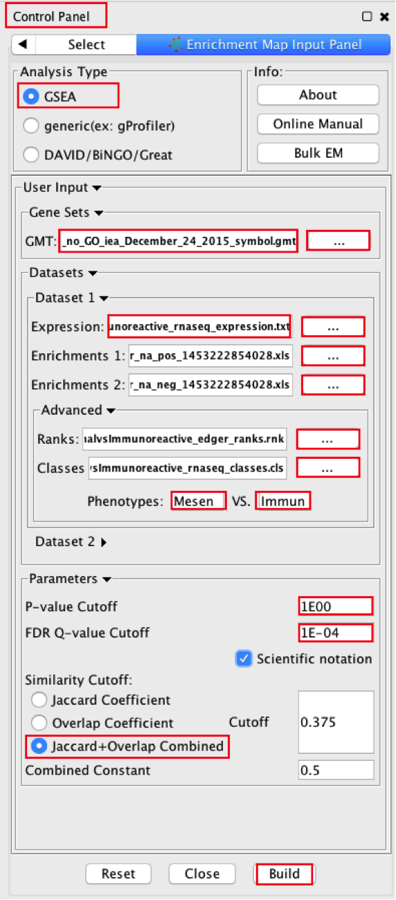
2a. Locate the Control Panel on the left side of the window, select the Enrichment Map input panel to load enrichment results.
2b. Specify the following parameters:
-
in Analysis Type select GSEA
-
in User Input:
-
GMT : load results files by clicking on the respective (…) button and selecting the Human_GOBP_AllPathways_no_GO_iea_December_24_2015_symbol.gmt file in the dialog.
-
Expression : MesenchymalvsImmunoreactive_RNSseq_expression.txt. TIP: This field is optional but recommended
-
Enrichments 1 : gsea_report_for_na_pos_1453222854028.xls
-
Enrichments 2 : gsea_report_for_na_neg_1453222854028.xls
- in Advanced:
- Ranks: MesenchymalvsImmunoreactive_edger_ranks.rnk
- Classes: MesenchymalvsImmunoreactive_rnaseq_classes.cls Tip: this field is optional but recommended.
- Phenotypes: In the text boxes replace UP with Mesenchymal and DOWN with Immunoreactive. Mesenchymal will be associated with red nodes because it corresponds to the positive phenotype and Immunoreactive will be associated with the blue nodes because it corresponds to the negative phenotype.
- in Parameters
- set P-Value Cutoff to 1 (= we are not using the pvalue as a selection criterion)
-
set FDR Q-value cut off to 0.0001 (= only gene-sets significantly enriched at a value of 0.0001 or less will be displayed on the map). Tip: it will be displayed as 1E-04 in the scientific notation.
- In Similarity cutoff
- Select “Jaccard” similarity cutoff and set the value to 0.375 (it calculates the number of edges to be displayed).
2c. Click on Build
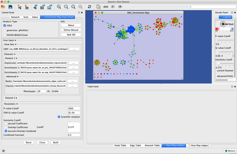
Unformatted results:
Note: layout will be different for each user (there is a random seed in the layout algorithm) but it does not change the results or interpretation (the connections are the same, only the display is different).
Step 3
Navigate the Enrichment Map to gain a better understanding of a EnrichmentMap network.
General layout of Cytoscape panel: In addition to the main window where the network is displayed, there are 3 panels: the Control Panel on the left side, the Results Panel on the right side and the Table Panel at the bottom of the window.
Steps:
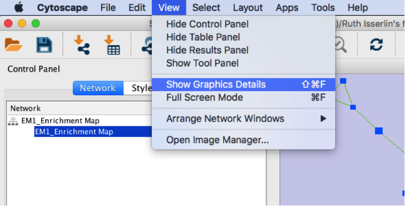
3a. In the menu bar, select View Show Graphic details. It will turn the squared nodes into circles and the gene-set labels will be visible.
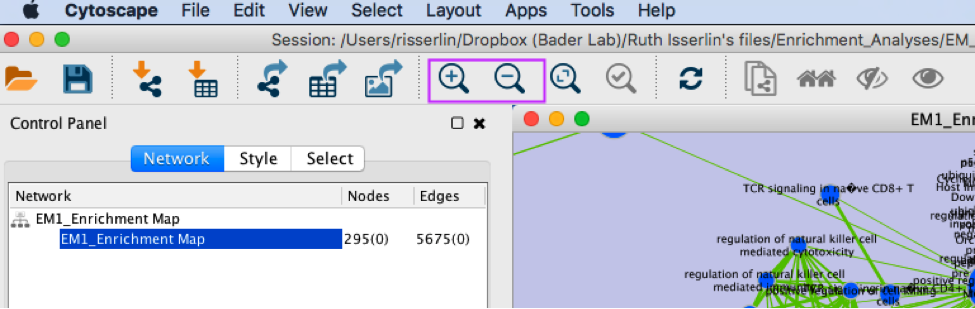
3b: Zoom in or out using + or - in toolbar or scroll button on mouse until you are able to read the labels comfortably.
3c: Use the bird’s eye view (located at the bottom of the control panel) to navigate around the network by moving the blue rectangle using the mouse or trackpad.
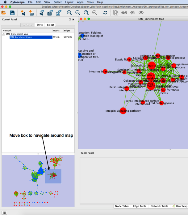
3d: Click on an individual node of interest.
For this example, you could use Integrin signalling pathway.
TIP: If you are unable to locate Integrin signalling pathway, type it in the search box. Selected nodes appear yellow (or highlighted) in the network
3e. In the Table Panel in the Heat map (nodes) tab change:
-
Normalization from “Data as is” to Row Normalize Data
-
Sorting from Hierarchical clustering to GSEARanking-Dataset 1
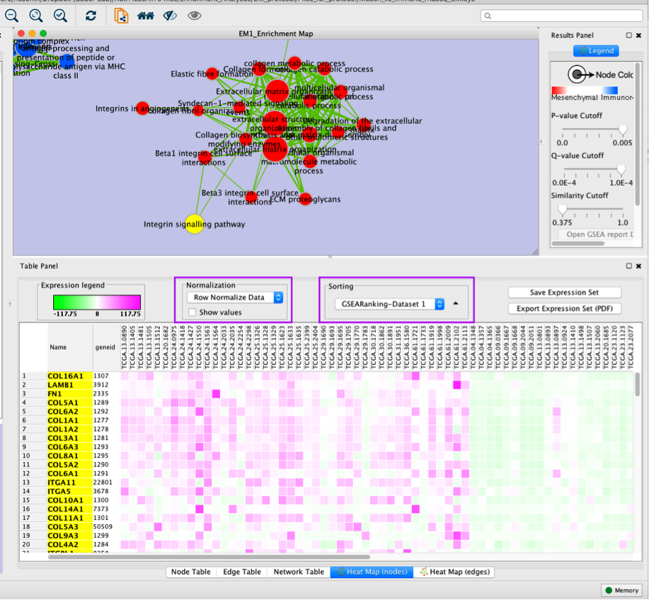
Tip: Genes in the heatmap that are highlighted yellow represent genes part of the leading edge for this gene set, i.e. contributed the most to the enriched phenotype. Leading edge genes will only be highlighted if an individual node has been selected and the Enrichment Map was created from GSEA results.
Step 4
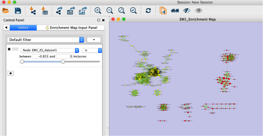
Use Filters to automatically select nodes on the map: Move the blue nodes to the left side of the window and the red nodes to the right side of the window.
4a. Locate the Select tab from the Control Panel.
4b. Click on the + sign to view the menu and select Column Filter.
4c. From the Choose column … box, select Node: EM1_ES_dataset1 and set filter values from -0.953 and 0 inclusive.
4d. The blue nodes are now automatically selected. Zoom out to be able to look at the entire network and drag all blue nodes to the left side of the screen.
4e. Optional. Change is to is not to select the red nodes.
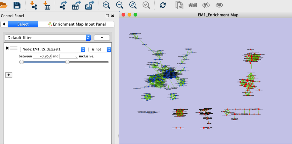
Note: the red pathways (nodes) are specific of the mesenchymal phenotype. There were listed in the pos table of the GSEA results. The enrichment score (ES) in this table are all positive values. The blue pathways are specific of the immunoreactive phenotype and were listed in the neg table of the GSEA results. The ES in this table are all negative values. This information has been used to set the filtering criteria.
Step 5
Optional exercise. Add drug target gene-sets to the network (Known Signature, PostAnalysis).
5a. From the menu bar, go to Apps, EnrichmentMap and select Load Post Analysis Panel.
5b. Locate the Control Panel located at the left side of the window and select the Post Analysis Input Panel.
5c. Select Known Signature.
5d. In the Gene-Sets section, click on the box (…) located at the right side of the SigGMT field to look for the Human_DrugBank_approved_symbol_selected.gmt file and click on Open.
5e. Click on Run located at the bottom of the panel.
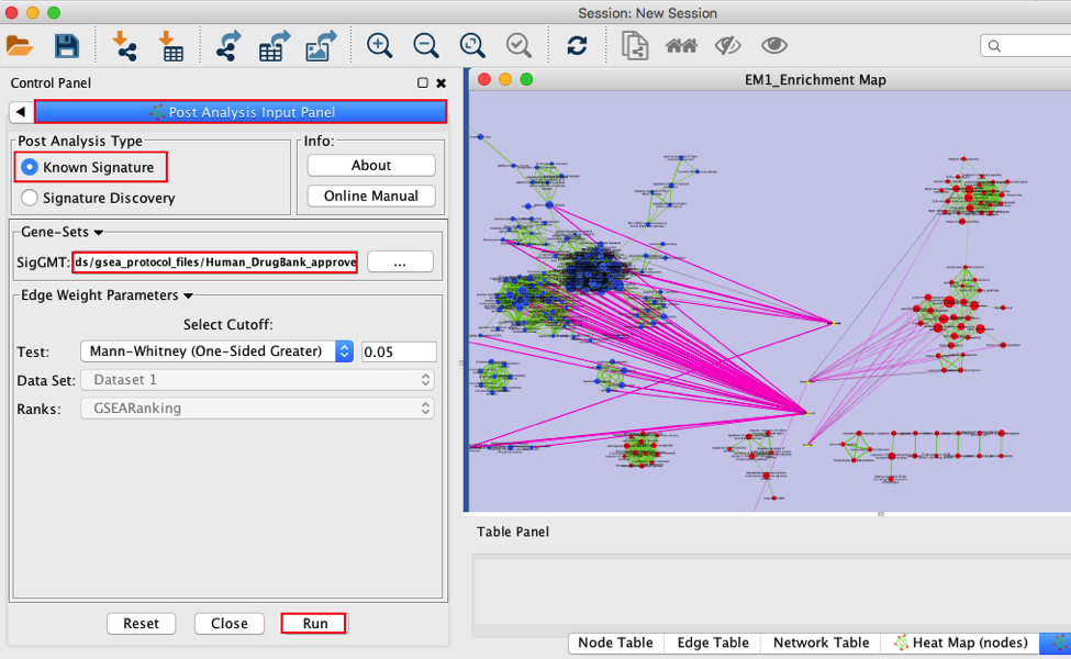
Note: Four additional nodes are now added to the network and visible as yellow triangles. Pink edges represent their overlap with the nodes of our network. These additional nodes represent gene targets of some approved drugs and these genes are either specific of the mesenchymal type (pink edges connected to red nodes) or specific of the immunoreactive type (pink edges connected to blue nodes).
Step 6
Optional exercise: Auto-annotate the network with cluster labels.
Important note: the Apps WordCloud, ClusterMaker and Autoannotate have to be installed.
6a. In the menu bar, select Apps, AutoAnnotate, New Annotation Set …. An Autoannotate: Create Annotation Set window pops up.
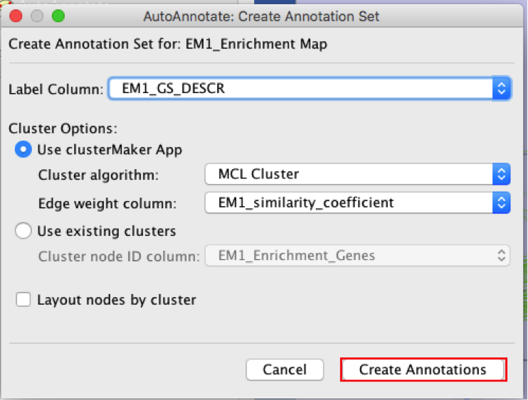
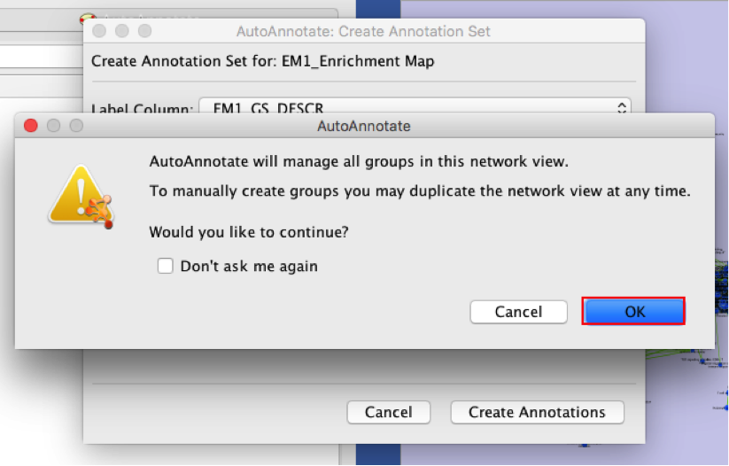
6b. Click on Create Annotations. An AutoAnnotate window pops up with the message AutoAnnotate will manage all groups in this network view.
6c. Click OK.
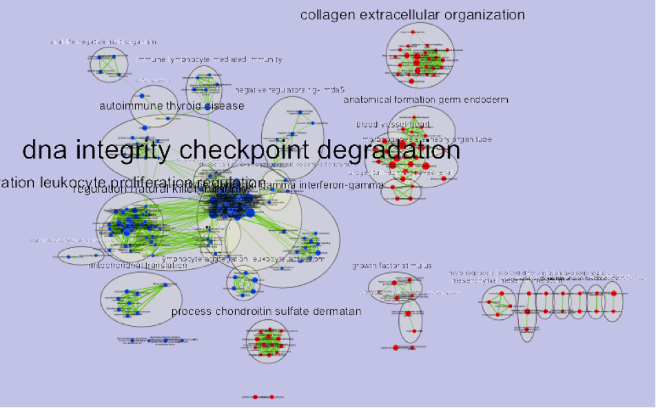
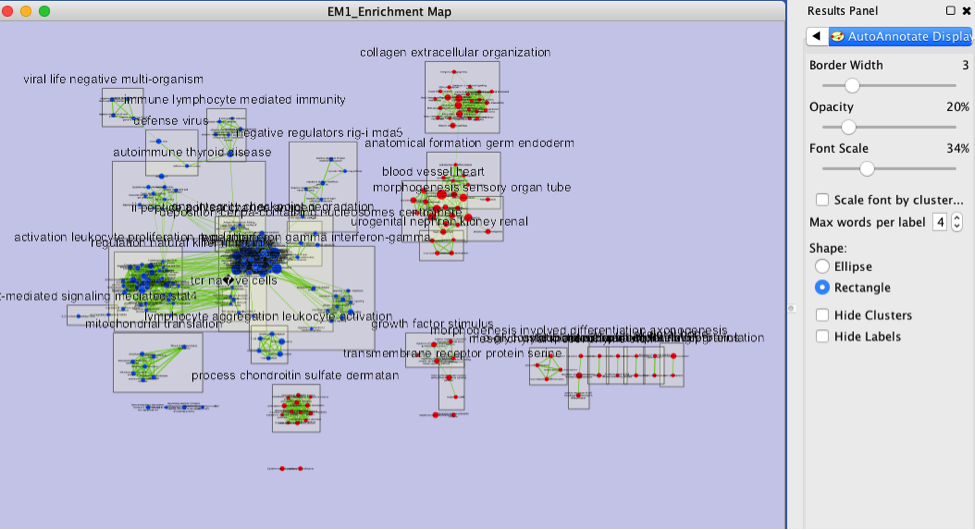
Note: The network is now subdivided into clusters that are represented by ellipses. Each of these clusters are composed of pathways (nodes) interconnected by many common genes. These pathways represent similar biological processes. The app WordCloud take all the labels of the pathways in one cluster and summarize them as a unique cluster label displayed at the top of each ellipse.
Tips: further editing and formatting can be performed on the AutoAnnote results using the AutoAnnotate Display in the Results Panels located at the right side of the window. For example, it is possible to change Ellipse to Rectangle, uncheck Scale font by cluster size and increase the Font Scale using the scaling bar.